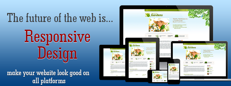
Hi I am Vicky Kumar. I recently designed a website by using html5 and css3 and I am excited to share my ideas on responsive web design with you. Responsive web design is no secret nowadays —it is not only to design the website but also it should be compatible to all the devices.
Today tablets, smart phones, laptop and pc are being used increasingly to view the websites. Each of devices have different range of screen sizes. So it’s imperative that designers prioritize the responsive factors while designing attractive interfaces. This is the key feature of responsive web design.
Here are a few quick tips to create effective responsive design:
The view port meta tag:
For flexible design, use the viewport meta tag in your head section of html. In its basic form, it will set you up for cross-device layout .
It assures you that no zooming will be applied. Using meta tag in the wrong way can create visual problems in website. Meta tag enables us to flexibility in the layout. Only we have to change initial
Scale value.
Media queries:
The layout needs to be automatically adjusted to fit all display resolution and devices whether it is Pc or the latest Smartphones and tablets. So basically In Responsive web design, a media query is a CSS declaration that is used as a parameter for when to call other style declarations based on the dimensions of the current viewing device. There are two ways to use a media queries in web page.
1. Inline call or Direct call:
2. External call:
Flexible grids layout
A flexible layout is core feature of responsive web design. For normal web design layout and text sizes are expressed in pixel. But for responsive web design stop using pixel-based layouts and start using percentages or the em for sizing. A simple formula is described below to find out the layout in percentages or em.
target ÷ context = result
Let’s say the normal context for the body font size is 25 pixels. If the designer specifies that the p should be 34 pixels, you can calculate the following:
34 ÷ 25 = 1.36
This results in the following CSS style:
p {font-size: 1.36em;}
Flexible Images
Instead of assigning an absolute width value via a HTML attribute in the tag of an image, assign the CSS rule max-width that targets the image as a percentage relative width value like so:
Quick navigation:
We can create quick navigation bar by using a pop-out or slide down menu. This navigation helps us to see navigation in small devices like mobile and smartphones.
Take home ideas
Responsive web design is a practical way to build websites that work well on all browsers and devices. Htm5 and css3 plays a vital role in designing responsive websites. Today many devices are coming in the market with various screen size. In the coming future, the responsive web design will gain tremendous popularity.


